It started with a phone call.
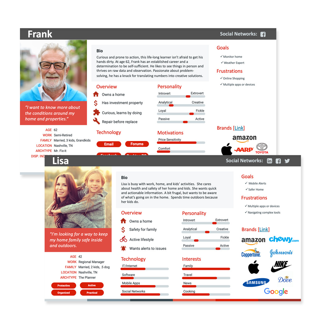
I was working as a UX designer for The Nielsen Company in 2015 when a past colleague of mine, Larry, called me up and told me about the project he was working on for AcuRite. He said, "We're building a new weather app and we have a clean slate to start with. We have existing users, a talented development team in place, but we need the user experience and design to bring it all together. Are you interested?" ... My reply was quick, "I'm in." I knew if Larry was involved, that it would be a good project. And, it was. A few weeks later, I was diving headfirst into the world of weather, and it was great.
- The Company: AcuRite.com - Chaney Instruments, Inc. in Lake Geneva, WI.
- Project Start: September 2015
- My role: UX Manager
Who is AcuRite?
Finding Solutions
Identifying the Problems
The older My Backyard Weather website and apps, also called Acu-Link, were becoming outdated and costly to maintain. The platform was nearly 7 years old, and users were requesting new features.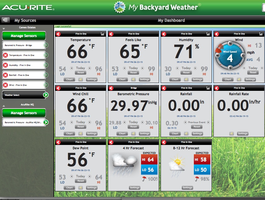
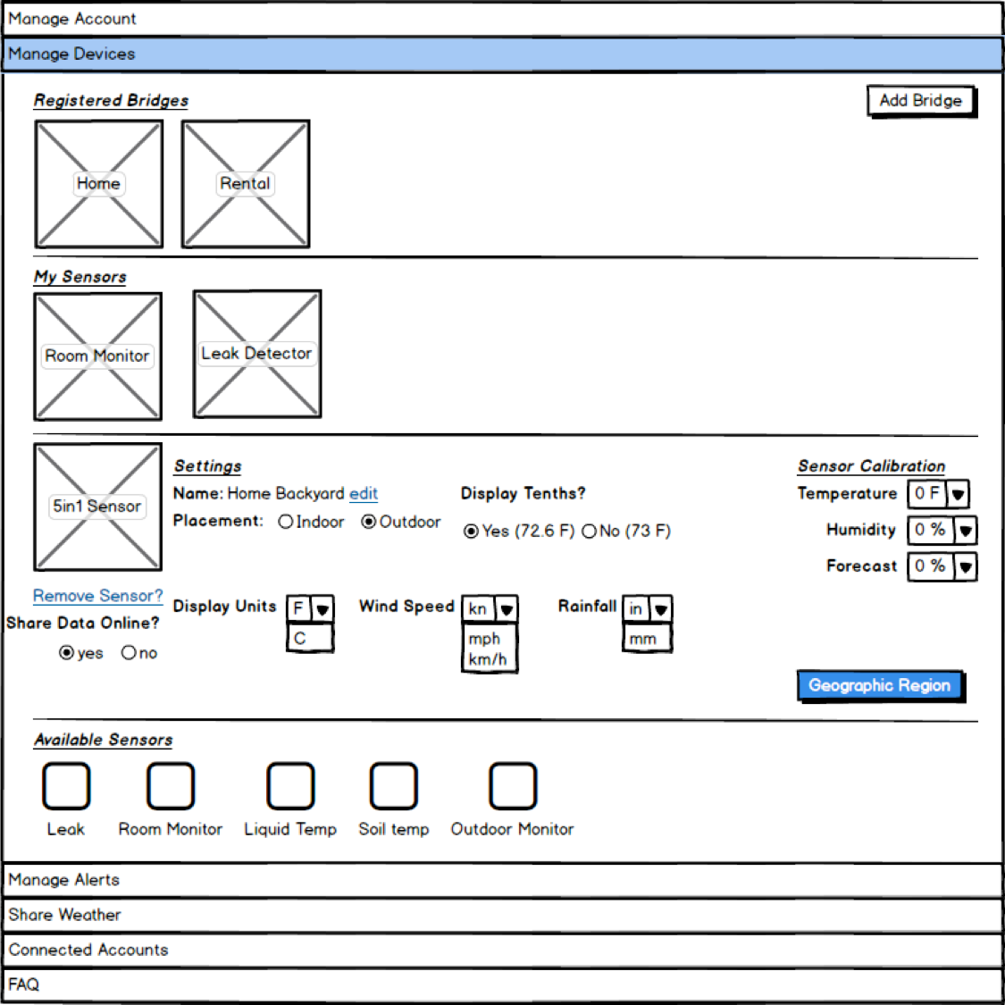
Early Mockups
I recommend starting the design process with low fidelity sketches. This helps iterate through many design options quickly
- This screen was an early attempt to satisfy all of the user stories for "Manage Devices"
- After user testing and feedback of this page, there were many changes that came about.
- One of the big changes that came about was changing from an "accordian" navigation between sections, to a tabbed layout.
- See the image below for a final version.
